For years, glossy magazines and Pinterest boards have told us that the ultimate dream home is sleek, modern, and drenched in pure white paint. It’s supposed to make rooms look bigger, brighter, and “timeless.” But before you run to the paint store and buy five gallons of Super Ultra Pure White, let’s talk about what really happens when you cover your entire home in white. Spoiler: it’s not always the fresh start you’re hoping for.
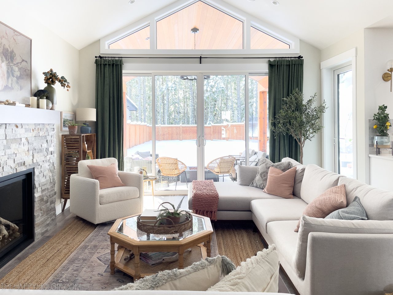
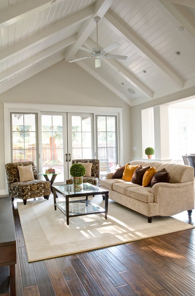
The Sterile Reality - White walls sound chic, but when you’re surrounded by them, things can feel less like “modern farmhouse” and more like “hospital waiting room.” The lack of warmth can make a space feel cold, clinical, and—dare I say—lifeless. Home is supposed to be cozy, not sterile.
White Walls, Green Glow? - Here’s a funny thing about white: it doesn’t always stay white. Think of it as a mirror in disguise. Got a big leafy tree outside your window? Suddenly your living room has a green tint. Live across from a bright orange building? Surprise—you just painted your walls pumpkin spice. White reflects whatever’s around it, which isn’t always flattering.
The High-Maintenance Lifestyle - Let’s be honest: white walls are divas. Every fingerprint, smudge, or scuff mark instantly shows up, and dust bunnies look like neon signs. Unless you’re prepared to touch up paint every other weekend, your “clean, crisp” white walls may quickly start looking tired and dirty.
The “Characterless Box” Effect - Paint everything white—the walls, the trim, the ceiling—and suddenly you’re living in a snow globe. It’s flat, it’s boring, and it erases all the personality that makes a house feel like your home.
When Bright Becomes Blinding - Natural light is wonderful, but combine it with stark white walls and you might find yourself squinting like you’re on a beach without sunglasses. Too much brightness isn’t energizing—it’s exhausting.
So, What Should You Do Instead? - Before you swear off white forever, here’s the good news: you don’t have to abandon it completely. You just need to be strategic.
-
Warm-toned whites: Swap out that harsh, pure white for something softer with undertones of yellow, cream, or gray. It instantly feels cozier and more welcoming.
-
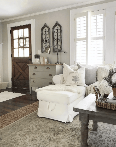
Add texture: Wood accents, woven rugs, soft textiles, and natural materials keep white walls from looking stark and sterile. Think of it as giving your walls some personality.
-
Play with color: Use white as a canvas, but bring in pops of color through art, accent walls, furniture, or even a bold front door. White works best when it’s not the only player on the team.
-
Always test first: Light changes everything. A white that looks soft in the morning can look icy by evening. Test your paint in different rooms and at different times of day before you commit.

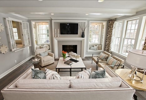
Final Thought - At the end of the day, painting your home pure white from floor to ceiling rarely gives you the cozy, welcoming vibe you want. The secret is balance. Instead of stark, blinding white, reach for light neutrals with gentle undertones—soft beiges or calming grays. These shades still give you that airy, open feel, but with warmth, depth, and a personality that’s anything but sterile.
The sweet spot isn’t pure white—it’s a light color with just enough beige or gray to make your home feel stylish, comfortable, and perfectly lived in.
Take a look at some of my favorites --
🌿 Benjamin Moore Picks
-
Athena (OC-20)
A sophisticated soft neutral with subtle gray and beige undertones. Airy without being stark, Athena gives you that fresh, light look while staying warm and livable. -
Revere Pewter (HC-172)
A beloved greige—balanced and versatile with a touch of green undertone. Cozy in dim light, airy in sunlit spaces. -
Edgecomb Gray (HC-173)
Soft, warm greige. Lighter and more welcoming than Revere Pewter—great for understated elegance. -
Balboa Mist (OC-27)
A light greige with a cooler bent. Sometimes shows a lavender undertone depending on lighting. -
Natural Cream (OC-14)
Creamy, off-white greige with a warm, buttery glow. Inviting but not heavy. -
Pale Oak (OC-20)
A graceful, warm gray that reads like an elegant neutral canvas. -
Collingwood (OC-28)
A mid-tone greige with balanced undertones—neither too cool nor too warm. -
Halo (OC-46)
Soft off-white greige with a delicate twilight glow—pairs beautifully with white trim.
☕ Sherwin-Williams Selections
-
Agreeable Gray (SW 7029)
One of Sherwin-Williams’ most popular shades for good reason—it’s the perfect greige. Soft gray balanced with just enough beige to feel warm, never flat.
-
Accessible Beige (SW 7036)
A warm beige with subtle gray undertones—rich without being dark. -
Drift of Mist (SW 9166)
A light greige that stays airy and bright, even in lower light rooms. -
Anew Gray (SW 7030)
Balanced mid-tone greige—ideal for depth while keeping things cozy. -
Worldly Gray (SW 7043)
Versatile medium greige—elegant and easy to pair. -
Perfect Greige (SW 6073)
A deeper, richer greige—excellent for accents or creating contrast. -
Amazing Gray (SW 7044)
Earthy greige with subtle green undertones—natural and organic feel.